오늘은 아래 유튜브 영상의 데스크탑 어플리케이션을 구현해보겠습니다.
https://www.youtube.com/watch?v=qSP8v8Gi3XU
1. 라이브러리 설치
이번 영상에서는 Material Design과 LiveCharts를 사용합니다. 아래의 명령으로 Package를 설치해줍니다.
dotnet add package MaterialDesignThemes --version 4.2.1 // material Design 설치
dotnet add package LiveCharts.Wpf --version 0.9.7 // live chart 설치
또는 Nuget GUI Manager 를 설치 후

Shift + Ctrl + P 로 명령창에서 Nuget 입력 시 나타나는 명령을 수행합니다.
그리고 Nuget Package Manager에서 아래와 같이 설치해줍니다. Material Design Themes와 Livecharts.wpf로 검색되는 패키지를 설치해줍니다.
2. 라이브러리 적용
Material Design을 적용해야합니다. 적용하는 방법은 구글에서 < material design xaml >이라고 검색하면 나오는데, 여기 사이트를 참조하시면 되겠습니다. 그리고, 나중에 livechart에서 사용할 스타일도 정의해놓겠습니다.
<App.xaml>
<Application x:Class="wpf_test04UT2.App"
             xmlns="http://schemas.microsoft.com/winfx/2006/xaml/presentation"
             xmlns:x="http://schemas.microsoft.com/winfx/2006/xaml"
             xmlns:local="clr-namespace:wpf_test04UT2"
             xmlns:lvc="clr-namespace:LiveCharts.Wpf;assembly=LiveCharts.Wpf"
             StartupUri="MainWindow.xaml">
    <Application.Resources>
         <ResourceDictionary>
            <ResourceDictionary.MergedDictionaries>
                <ResourceDictionary Source="pack://application:,,,/MaterialDesignThemes.Wpf;component/Themes/MaterialDesignTheme.Light.xaml" />
                <ResourceDictionary Source="pack://application:,,,/MaterialDesignThemes.Wpf;component/Themes/MaterialDesignTheme.Defaults.xaml" />
                <ResourceDictionary Source="pack://application:,,,/MaterialDesignColors;component/Themes/Recommended/Primary/MaterialDesignColor.DeepPurple.xaml" />
                <ResourceDictionary Source="pack://application:,,,/MaterialDesignColors;component/Themes/Recommended/Accent/MaterialDesignColor.Lime.xaml" />
            </ResourceDictionary.MergedDictionaries>
            <Style TargetType="lvc:LineSeries">
                <Setter Property="StrokeThickness" Value="3"></Setter>
                <Setter Property="Fill" Value="#4EFFFFFF"></Setter>
                <Setter Property="PointGeometrySize" Value="0"></Setter>
                <Setter Property="LineSmoothness" Value="0"></Setter>
            </Style>
            <Style TargetType="lvc:Axis">
                <Setter Property="ShowLabels" Value="False"></Setter>
                <Setter Property="IsEnabled" Value="False"></Setter>
            </Style>
        </ResourceDictionary>
    </Application.Resources>
</Application>
3. 메인프레임 구성
메인 프레임에서는 전체적인 틀을 Grid 레이아웃으로 잡아주고, 좌측 그리드에 메뉴를 Material Design Icon으로 구성합니다.
<MainWindow.xaml>
<Window x:Class="wpf_test04UT2.MainWindow"
        xmlns="http://schemas.microsoft.com/winfx/2006/xaml/presentation"
        xmlns:x="http://schemas.microsoft.com/winfx/2006/xaml"
        xmlns:d="http://schemas.microsoft.com/expression/blend/2008"
        xmlns:mc="http://schemas.openxmlformats.org/markup-compatibility/2006"
        xmlns:local="clr-namespace:wpf_test04UT2"
        xmlns:materialDesign="http://materialdesigninxaml.net/winfx/xaml/themes"
        mc:Ignorable="d"
        Title="MainWindow" Height="850" Width="1200"
        WindowStartupLocation="CenterScreen"
        WindowStyle="None"
        Background="{x:Null}"
        AllowsTransparency="True" Loaded="Window_Loaded">
    <Grid>
        <materialDesign:Card Margin="10" UniformCornerRadius="15">
            <Grid>
                <Grid.ColumnDefinitions>
                    <ColumnDefinition Width="1*" />
                    <ColumnDefinition Width="15*" />
                </Grid.ColumnDefinitions>
                <Grid.Resources>
                    <Style TargetType="materialDesign:PackIcon">
                        <Setter Property="Width" Value="30"></Setter>
                        <Setter Property="Height" Value="30"></Setter>
                    </Style>
                </Grid.Resources>
                <Grid Grid.Column="0">
                    <ListView Margin="0 15">
                        <ListViewItem HorizontalAlignment="Center" Margin="0 10">
                            <Button Style="{StaticResource MaterialDesignFloatingActionButton}" HorizontalAlignment="Left"
                            BorderBrush="{x:Null}" Foreground="Black">
                                <StackPanel Margin="-5">
                                    <materialDesign:PackIcon Kind="Resistor" />
                                </StackPanel>
                            </Button>
                        </ListViewItem>
                        <ListViewItem HorizontalAlignment="Center" Margin="0 10">
                            <Button Style="{StaticResource MaterialDesignFloatingActionButton}" HorizontalAlignment="Left"
                            BorderBrush="{x:Null}" Foreground="Black">
                                <StackPanel Margin="-5">
                                    <materialDesign:PackIcon Kind="CircleSlice6" />
                                </StackPanel>
                            </Button>
                        </ListViewItem>
                        <ListViewItem HorizontalAlignment="Center" Margin="0 10">
                            <Button Style="{StaticResource MaterialDesignFloatingActionButton}" HorizontalAlignment="Left"
                            BorderBrush="{x:Null}" Foreground="Black">
                                <StackPanel Margin="-5">
                                    <materialDesign:PackIcon Kind="CalendarBlankOutline" />
                                </StackPanel>
                            </Button>
                        </ListViewItem>
                        <ListViewItem HorizontalAlignment="Center" Margin="0 10">
                            <Button Style="{StaticResource MaterialDesignFloatingActionButton}" HorizontalAlignment="Left"
                            BorderBrush="{x:Null}" Foreground="Black">
                                <StackPanel Margin="-5">
                                    <materialDesign:PackIcon Kind="EqualiserVertical" />
                                </StackPanel>
                            </Button>
                        </ListViewItem>
                        <ListViewItem HorizontalAlignment="Center" Margin="0 10">
                            <Button Style="{StaticResource MaterialDesignFloatingActionButton}" HorizontalAlignment="Left"
                            BorderBrush="{x:Null}" Foreground="Black">
                                <StackPanel Margin="-5">
                                    <materialDesign:PackIcon Kind="ChatOutline" />
                                </StackPanel>
                            </Button>
                        </ListViewItem>
                        <ListViewItem HorizontalAlignment="Center" Margin="0 60 0 0">
                            <Button Style="{StaticResource MaterialDesignFloatingActionButton}" HorizontalAlignment="Left"
                            BorderBrush="{x:Null}" Foreground="Black" x:Name="btnExit" Click="btnExit_click">
                                <StackPanel Margin="-5">
                                    <materialDesign:PackIcon Kind="ExitToApp" />
                                </StackPanel>
                            </Button>
                        </ListViewItem>
                    </ListView>
                </Grid>
                <Grid Grid.Column="1" Background="#f6f5f8" Name="RenderPages">

                </Grid>
            </Grid>
        </materialDesign:Card>
    </Grid>
</Window>
이번 과제는 UI에 집중되어 있어서, cs파일에서는 별로 할일이 없습니다.
<MainWindow.xaml.cs>
using System.Windows;

namespace wpf_test04UT2
{
  /// <summary>
  /// Interaction logic for MainWindow.xaml
  /// </summary>
  public partial class MainWindow : Window
    {
        public MainWindow()
        {
            InitializeComponent();
        }
        private void Window_Loaded(object sender, RoutedEventArgs e)
        {
            RenderPages.Children.Clear();
            RenderPages.Children.Add(new Dashboard());
        }
        private void btnExit_click(object sender, RoutedEventArgs e)
        {
            Application.Current.Shutdown();
        }
    }
}
4. 내부 Dashboard 작성
메인프레임에 뿌려줄 '내부'를 별도파일(UserControl)로 구현합니다. Material Design 사용하니까 이쁘고 좋긴 한데, 코드가 길어지고....익숙해지는데 시간이 좀 필요하겠네요..
<Dashboard.xaml>
<UserControl x:Class="wpf_test04UT2.Dashboard"
xmlns="http://schemas.microsoft.com/winfx/2006/xaml/presentation"
xmlns:x="http://schemas.microsoft.com/winfx/2006/xaml"
xmlns:d="http://schemas.microsoft.com/expression/blend/2008"
xmlns:mc="http://schemas.openxmlformats.org/markup-compatibility/2006"
xmlns:local="clr-namespace:wpf_test04UT2"
xmlns:materialDesign="http://materialdesigninxaml.net/winfx/xaml/themes"
xmlns:lvc="clr-namespace:LiveCharts.Wpf;assembly=LiveCharts.wpf"
mc:Ignorable="d"
Height="850" Width="1100">
<Grid>
<Grid.ColumnDefinitions>
<ColumnDefinition Width="8*" />
<ColumnDefinition Width="4*" />
</Grid.ColumnDefinitions>
<Grid.Resources>
<Style TargetType="materialDesign:PackIcon">
<Setter Property="Width" Value="30"></Setter>
<Setter Property="Height" Value="30"></Setter>
</Style>
</Grid.Resources>
<Grid Grid.Column="0" Background="#f6f6f8">
<StackPanel Margin="10">
<Grid Height="60">
<Button Style="{StaticResource MaterialDesignFloatingActionButton}" HorizontalAlignment="Left"
BorderBrush="{x:Null}" Background="{x:Null}">
<StackPanel Margin="5">
<materialDesign:PackIcon Kind="ReorderHorizontal" Foreground="Gray" />
</StackPanel>
</Button>
<ComboBox HorizontalAlignment="Right" Width="100" materialDesign:HintAssist.Hint="Last 15 Days">
<ComboBoxItem>
<TextBlock Text="Last 15 Days" />
</ComboBoxItem>
<ComboBoxItem>
<TextBlock Text="Last 30 Days" />
</ComboBoxItem>
</ComboBox>
</Grid>
<WrapPanel HorizontalAlignment="Center">
<Border BorderBrush="White" BorderThickness="5" Margin="20 0" CornerRadius="15">
<materialDesign:Card materialDesign:ShadowAssist.ShadowDepth="Depth0" UniformCornerRadius="15" BorderThickness="5"
BorderBrush="White" Width="110" Height="130" Background="#F6F6F8">
<StackPanel Margin="10">
<materialDesign:PackIcon Kind="Twitter" Foreground="#29A3EC" />
<TextBlock FontWeight="SemiBold" FontSize="25" Text="280K" Margin="0 10 0 0" />
<TextBlock FontSize="12" Text="Follwers" />
<materialDesign:PackIcon Kind="EllipsisHorizontal" HorizontalAlignment="Right" />
</StackPanel>
</materialDesign:Card>
</Border>
<Border BorderBrush="White" BorderThickness="5" Margin="20 0" CornerRadius="15">
<materialDesign:Card materialDesign:ShadowAssist.ShadowDepth="Depth0" UniformCornerRadius="15" BorderThickness="5"
BorderBrush="White" Width="110" Height="130" Background="#F6F6F8">
<StackPanel Margin="10">
<materialDesign:PackIcon Kind="Instagram">
<materialDesign:PackIcon.Foreground>
<LinearGradientBrush StartPoint="1,0" EndPoint="0.5,1">
<GradientStop Color="#912A73" Offset="0" />
<GradientStop Color="#FA8E22" Offset="1" />
</LinearGradientBrush>
</materialDesign:PackIcon.Foreground>
</materialDesign:PackIcon>
<TextBlock FontWeight="SemiBold" FontSize="25" Text="690K" Margin="0 10 0 0" />
<TextBlock FontSize="12" Text="Followers" />
<materialDesign:PackIcon Kind="EllipsisHorizontal" HorizontalAlignment="Right" />
</StackPanel>
</materialDesign:Card>
</Border>
<Border BorderBrush="White" BorderThickness="5" Margin="20 0" CornerRadius="15">
<materialDesign:Card materialDesign:ShadowAssist.ShadowDepth="Depth0" UniformCornerRadius="15" BorderThickness="5"
BorderBrush="White" Width="110" Height="130" Background="#F6F6F8">
<StackPanel Margin="10">
<materialDesign:PackIcon Kind="Youtube" Foreground="#29A3EC" />
<TextBlock FontWeight="SemiBold" FontSize="25" Text="2.3M" Margin="0 10 0 0" />
<TextBlock FontSize="12" Text="Follwers" />
<materialDesign:PackIcon Kind="EllipsisHorizontal" HorizontalAlignment="Right" />
</StackPanel>
</materialDesign:Card>
</Border>
<Border BorderBrush="White" BorderThickness="5" Margin="20 0" CornerRadius="15">
<materialDesign:Card materialDesign:ShadowAssist.ShadowDepth="Depth0" UniformCornerRadius="15" BorderThickness="5"
BorderBrush="White" Width="110" Height="130" Background="#F6F6F8">
<StackPanel Margin="10">
<materialDesign:PackIcon Kind="Facebook" Foreground="#29A3EC" />
<TextBlock FontWeight="SemiBold" FontSize="25" Text="60K" Margin="0 10 0 0" />
<TextBlock FontSize="12" Text="Follwers" />
<materialDesign:PackIcon Kind="EllipsisHorizontal" HorizontalAlignment="Right" />
</StackPanel>
</materialDesign:Card>
</Border>
</WrapPanel>
<materialDesign:Card Margin="30 20" UniformCornerRadius="20">
<StackPanel>
<Grid>
<TextBlock Margin="20" HorizontalAlignment="Left" FontWeight="SemiBold" Text="Instagram Subscribers" FontSize="18"/>
<StackPanel Orientation="Horizontal" HorizontalAlignment="Right">
<TextBlock FontWeight="ExtraBold" FontSize="14" Text="" FontFamily="wingdings" VerticalAlignment="Center" Foreground="#42A5F4" />
<TextBlock Text="Gained" HorizontalAlignment="Right" VerticalAlignment="Center" FontWeight="SemiBold" FontSize="14" Margin="5 0 10 0"/>
<TextBlock FontWeight="ExtraBold" FontSize="14" Text="" FontFamily="wingdings" VerticalAlignment="Center" Foreground="#F55F54" />
<TextBlock Text="Lost" HorizontalAlignment="Right" VerticalAlignment="Center" FontWeight="SemiBold" FontSize="14" Margin="5 0 20 0" />
</StackPanel>
</Grid>
<lvc:CartesianChart Series="{Binding SeriesCollection}" Foreground="Black" Margin="10 0" Height="200">
<lvc:CartesianChart.AxisX>
<lvc:Axis Labels="{Binding Labels}" Separator="{x:Static lvc:DefaultAxes.CleanSeparator}" />
</lvc:CartesianChart.AxisX>
<lvc:CartesianChart.AxisY>
<lvc:Axis LabelFormatter="{Binding Formatter}" />
</lvc:CartesianChart.AxisY>
</lvc:CartesianChart>
</StackPanel>
</materialDesign:Card>
<WrapPanel HorizontalAlignment="Center">
<materialDesign:Card Margin="10" UniformCornerRadius="20" Padding="10">
<StackPanel>
<TextBlock Text="Key Matrics" Margin="10 20" FontWeight="SemiBold"/>
<Grid Height="150">
<Grid.ColumnDefinitions>
<ColumnDefinition />
<ColumnDefinition />
</Grid.ColumnDefinitions>
<Grid.RowDefinitions>
<RowDefinition />
<RowDefinition />
<RowDefinition />
<RowDefinition />
</Grid.RowDefinitions>
<TextBlock Text="Clicks" Grid.Column="0" Grid.Row="0" HorizontalAlignment="Center" VerticalAlignment="Center" FontSize="13" FontWeight="SemiBold" />
<TextBlock Text="Links" Grid.Column="0" Grid.Row="1" HorizontalAlignment="Center" VerticalAlignment="Center" FontSize="13" FontWeight="SemiBold" />
<TextBlock Text="Followers" Grid.Column="0" Grid.Row="2" HorizontalAlignment="Center" VerticalAlignment="Center" FontSize="13" FontWeight="SemiBold" />
<TextBlock Text="Impressions" Grid.Column="0" Grid.Row="3" HorizontalAlignment="Center" VerticalAlignment="Center" FontSize="13" FontWeight="SemiBold" />
<StackPanel Grid.Column="1" Grid.Row="0" HorizontalAlignment="Center" VerticalAlignment="Center" Orientation="Horizontal">
<TextBlock Text="10K" FontWeight="SemiBold" Margin="5 0" />
<ProgressBar Margin="5 0" Width="100" Height="8" Foreground="#FFFFFF13" Background="#FFE8E8E8" BorderBrush="#FFF3F349" Value="78" />
<TextBlock Text="12K" FontWeight="SemiBold" />
</StackPanel>
<StackPanel Grid.Column="1" Grid.Row="2" HorizontalAlignment="Center" VerticalAlignment="Center" Orientation="Horizontal">
<TextBlock Text="10K" FontWeight="SemiBold" Margin="5 0" />
<ProgressBar Margin="5 0" Width="100" Height="8" Foreground="#FFFFFF13" Background="#FFE8E8E8" BorderBrush="#FFF3F349" Value="78" />
<TextBlock Text="12K" FontWeight="SemiBold" />
</StackPanel>
<StackPanel Grid.Column="1" Grid.Row="1" HorizontalAlignment="Center" VerticalAlignment="Center" Orientation="Horizontal">
<TextBlock Text="10K" FontWeight="SemiBold" Margin="5 0" />
<ProgressBar Margin="5 0" Width="100" Height="8" Foreground="SeaGreen" Background="#FFE8E8E8" BorderBrush="SeaGreen" Value="78" />
<TextBlock Text="12K" FontWeight="SemiBold" />
</StackPanel>
<StackPanel Grid.Column="1" Grid.Row="3" HorizontalAlignment="Center" VerticalAlignment="Center" Orientation="Horizontal">
<TextBlock Text="10K" FontWeight="SemiBold" Margin="5 0" />
<ProgressBar Margin="5 0" Width="100" Height="8" Foreground="SeaGreen" Background="#FFE8E8E8" BorderBrush="SeaGreen" Value="78" />
<TextBlock Text="12K" FontWeight="SemiBold" />
</StackPanel>
</Grid>
</StackPanel>
</materialDesign:Card>
<materialDesign:Card Margin="10" UniformCornerRadius="20" Background="#633648">
<StackPanel Margin="10">
<TextBlock Text="Engagged Users" FontSize="14" Foreground="White" TextAlignment="Center" />
<TextBlock Text="12.5K" TextAlignment="Center" Margin="0 5" Foreground="White" FontSize="18" />
<lvc:CartesianChart Margin="0 5" Series="{Binding LastHourSeries}" Hoverable="False" DataTooltip="{x:Null}" Height="160" Width="160">
<lvc:CartesianChart.AxisX>
<lvc:Axis MinValue="0" />
</lvc:CartesianChart.AxisX>
</lvc:CartesianChart>
<materialDesign:PackIcon Kind="ArrowUp" HorizontalAlignment="Center" Margin="0 5" Width="20" Height="20" Foreground="#62A78B" />
</StackPanel>
</materialDesign:Card>
<materialDesign:Card Margin="10" UniformCornerRadius="20" Background="#633648">
<StackPanel Margin="10">
<TextBlock Text="Page Impression" FontSize="14" Foreground="White" TextAlignment="Center" />
<TextBlock Text="12.5K" TextAlignment="Center" Margin="0 5" Foreground="White" FontSize="18" />
<lvc:CartesianChart Margin="0 5" Series="{Binding LastHourSeries1}" Hoverable="False" DataTooltip="{x:Null}" Height="160" Width="160">
<lvc:CartesianChart.AxisX>
<lvc:Axis MinValue="0" />
</lvc:CartesianChart.AxisX>
</lvc:CartesianChart>
<materialDesign:PackIcon Kind="ArrowUp" HorizontalAlignment="Center" Margin="0 5" Width="20" Height="20" Foreground="#62A78B" />
</StackPanel>
</materialDesign:Card>
</WrapPanel>
</StackPanel>
</Grid>
<StackPanel Grid.Column="1" Background="White">
<WrapPanel VerticalAlignment="Top" Margin="20 20 20 10">
<Button Style="{StaticResource MaterialDesignFloatingActionButton}" Background="{x:Null}" BorderBrush="{x:Null}" Foreground="Black">
<StackPanel Margin="-5">
<materialDesign:PackIcon Kind="BellOutline" />
</StackPanel>
</Button>
<Button Background="#FFFFEEFA" BorderBrush="#FFFFEEFA" Foreground="#FFF0689E" Margin="10 0" Height="40">
<WrapPanel HorizontalAlignment="Center" >
<materialDesign:PackIcon Kind="GiftOutline" Width="25" Height="25" />
<TextBlock Text="2 NEW UPDATES" VerticalAlignment="Center" FontWeight="SemiBold" Margin="10 0" />
</WrapPanel>
</Button>
<Button Style="{StaticResource MaterialDesignFloatingActionButton}" Background="{x:Null}" BorderBrush="{x:Null}" Foreground="Black">
<StackPanel Margin="-5">
<materialDesign:PackIcon Kind="BellOutline" />
</StackPanel>
</Button>
</WrapPanel>
<Border Margin="40 10" CornerRadius="20" Background="#FFFFFEFA">
<Image Source="Images/aaa.jpg" Stretch="Uniform" x:Name="ImgCartoon" Height="150" />
</Border>
<Calendar Margin="45 10" />
<materialDesign:Card Margin="20 10" Padding="5" UniformCornerRadius="20" HorizontalAlignment="Center">
<WrapPanel Margin="10">
<materialDesign:PackIcon Kind="HandPeace" Foreground="#FFC83D" VerticalAlignment="Center" Margin="10 0" />
<TextBlock Margin="10 0" VerticalAlignment="Center">
<TextBlock.Inlines>
<Run Text="Say Hi To" />
<Run Text="Laith Hart" FontWeight="SemiBold" FontSize="14" />
</TextBlock.Inlines>
</TextBlock>
<Image Source="Images/bbb.jpg" Width="40" Height="40" x:Name="avatar1" Margin="10 0" />
</WrapPanel>
</materialDesign:Card>
<materialDesign:Card Margin="20 10" Padding="5" UniformCornerRadius="20" HorizontalAlignment="Center">
<WrapPanel Margin="10">
<materialDesign:PackIcon Kind="HandPeace" Foreground="#FFC83D" VerticalAlignment="Center" Margin="10 0" />
<TextBlock Margin="10 0" VerticalAlignment="Center">
<TextBlock.Inlines>
<Run Text="Say Hi To" />
<Run Text="Laith Hart" FontWeight="SemiBold" FontSize="14" />
</TextBlock.Inlines>
</TextBlock>
<Image Source="Images/bbb.jpg" Width="40" Height="40" x:Name="avatar2" Margin="10 0" />
</WrapPanel>
</materialDesign:Card>
</StackPanel>
</Grid>
</UserControl>
차트에 뿌려줄 데이터 및 동작을 cs파일에 구현합니다.
<Dashboard.xaml.cs>
using LiveCharts;
using LiveCharts.Wpf;
using System;
using System.IO;
using LiveCharts.Defaults;
using System.Windows.Controls;
using System.Windows.Media.Imaging;

namespace wpf_test04UT2
{

  public partial class Dashboard : UserControl
  {
    public SeriesCollection SeriesCollection { get; set; }
    public SeriesCollection LastHourSeries { get; set;  }
    public SeriesCollection LastHourSeries1 { get; set;  }
    public string[] Labels { get; set; }
    public Func<double,string> Formatter { get; set; }
    public Dashboard()
    {
      InitializeComponent();
      SeriesCollection = new SeriesCollection{
        new StackedColumnSeries
        {
          Values = new ChartValues<double> {25, 52, 61, 89},
          StackMode = StackMode.Values,
          DataLabels = true
        },
        new StackedColumnSeries
        {
          Values = new ChartValues<double> {-15, -75, -16, -49},
          StackMode = StackMode.Values,
          DataLabels = true
        }
      };
      LastHourSeries = new SeriesCollection
      {
        new LineSeries
        {
          AreaLimit = -10,
          Values = new ChartValues<ObservableValue>
          {
            new ObservableValue(3),
            new ObservableValue(1),
            new ObservableValue(9),
            new ObservableValue(4),
            new ObservableValue(5),
            new ObservableValue(3),
            new ObservableValue(1),
            new ObservableValue(2),
            new ObservableValue(3),
            new ObservableValue(7),
          }
        }
      };
      LastHourSeries1 = new SeriesCollection
      {
        new LineSeries
        {
          AreaLimit = -10,
          Values = new ChartValues<ObservableValue>
          {
            new ObservableValue(13),
            new ObservableValue(11),
            new ObservableValue(9),
            new ObservableValue(14),
            new ObservableValue(5),
            new ObservableValue(3),
            new ObservableValue(1),
            new ObservableValue(2),
            new ObservableValue(3),
            new ObservableValue(7),
          }
        }
      };
      Labels = new[] { "Feb 7", "Feb8", "Feb 9", "Feb 10" };
      Formatter = GetValue => GetValue.ToString();
      DataContext = this;
      string imgCartoon = Directory.GetCurrentDirectory().ToString()+"\\Images\\aaa.jpg";
      string imgavatar  = Directory.GetCurrentDirectory().ToString()+"\\Images\\bbb.jpg";
      ImgCartoon.Source = new BitmapImage(new Uri(imgCartoon));
      avatar1.Source = new BitmapImage(new Uri(imgavatar));
      avatar2.Source = new BitmapImage(new Uri(imgavatar));
    }
  }
}
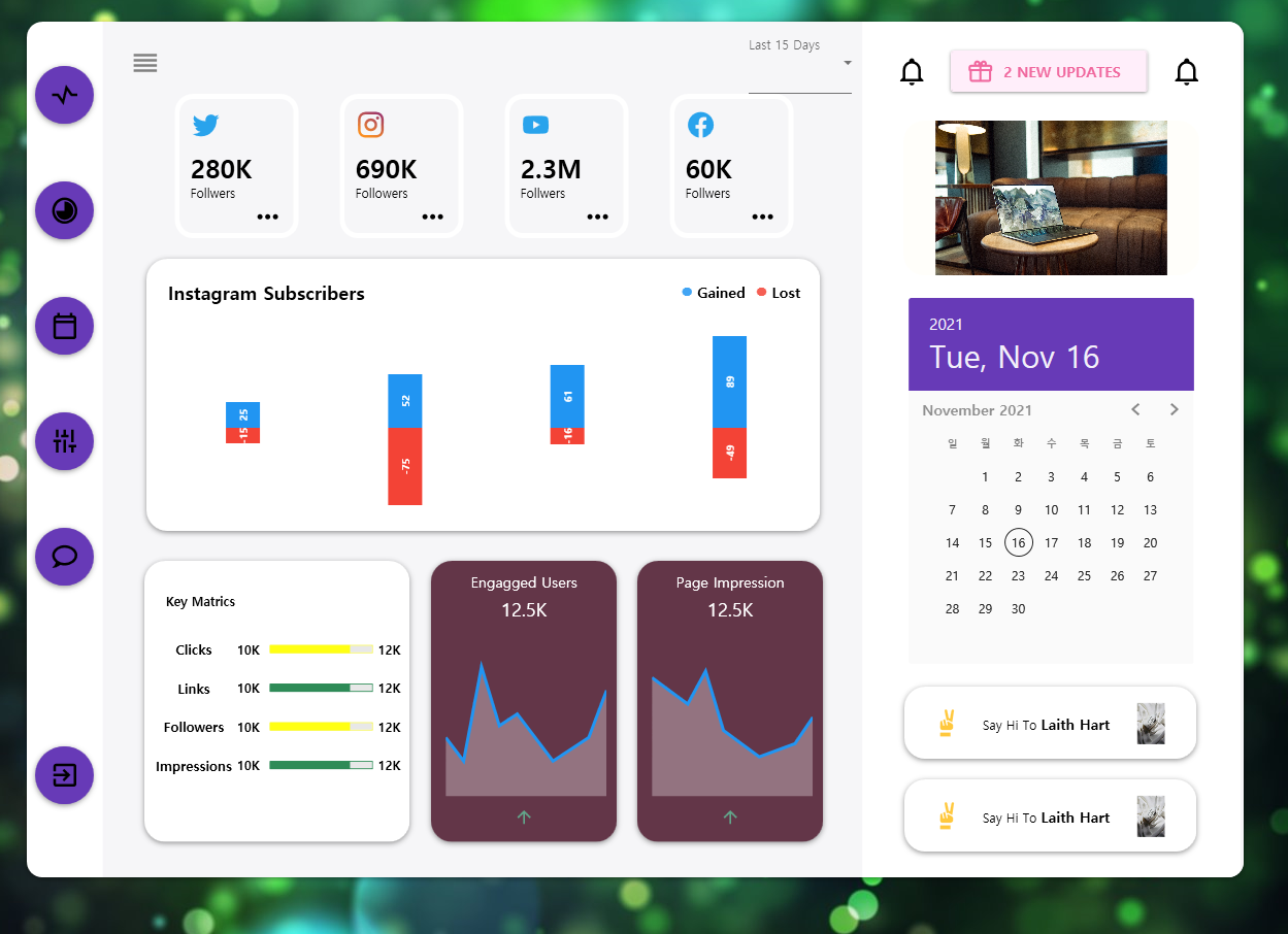
5. 결과
좀 있어보이나요? 좌측 메뉴가 동영상 강좌랑 달리 스타일이 안들어간 것 같습니다만, 수정하기 귀찮네요..필요할 때 하다보면 되겠죠..??ㅠㅠ
~~~끝~~~
'Programming > C#' 카테고리의 다른 글
| C#(WPF) 프린트 - 단순 출력부터 다이얼로그 없이 출력하기까지 (0) | 2022.01.14 |
|---|---|
| C#(WPF) - VSCode에서 Resource Directory 추가하기 (0) | 2021.11.02 |
| C#(WPF) - GUI 연습하기(with Material Design) (0) | 2021.10.29 |
| C#(WPF) - VSCode에서 Material Design 적용하기 (0) | 2021.10.28 |
| C#(WPF) - VSCode에서 GUI 시작하기 (0) | 2021.10.22 |