1:N관계에서 N쪽 테이블(TempDataroomHstry클래스)에 ForeignKey로 1쪽 테이블명(Temp래스)을 지정해줍니다. 이때, 1쪽 테이블의 참조하려는 필드가 Primary Key로 지정되어있으면 상관없지만, 없을 경우 필드 정의에(ForeignKey 함수 내부에서) to__field='목표필드' 를 지정해줘야 합니다. 그리고, db_column='참조칼럼명' 에서 해당 테이블에서 참조할 실제 칼럼(필드)명을 지정해줘야 합니다.
(*) Oracle DB에서만 이런 문제가 발생하는 것인지.. 아직은 잘 모르겠습니다. 이것 때문에 한참을 헤메었네요..^^;; 또한 이번의 경우 Temp의 emp_field와 TempDataroomHstry의 id는 사실 칼럼명은 동일하게 'emp_#'이었습니다. db_column에 넣어주는 값이 현재 테이블의 칼럼명인지, 목표 테이블의 칼럼명인지 좀 헷갈립니다...
<models.py>
from django.db import models


class Temp(models.Model):
    emp_field = models.CharField(db_column='emp_#', primary_key=True, max_length=7)  # Field renamed to remove unsuitable characters. Field renamed because it ended with '_'.
    emp_x = models.CharField(max_length=2, blank=True, null=True)
    kornm_n = models.CharField(max_length=32, blank=True, null=True)
    res_1 = models.CharField(db_column='res_#1', max_length=12, blank=True, null=True)  # Field renamed to remove unsuitable characters.
    sex_n = models.CharField(max_length=2, blank=True, null=True)
    dept_c = models.CharField(max_length=16, blank=True, null=True)

    class Meta:
        managed = False
        db_table = 'TEMP'


class TempDataroomHstry(models.Model):
    seq_field = models.IntegerField(db_column='seq_#',primary_key=True)  # Field renamed to remove unsuitable characters. Field renamed because it ended with '_'.
    id = models.ForeignKey(Temp, to_field='emp_field', db_column='emp_#',on_delete=models.CASCADE, null=True, related_name='id')   #, related_name='tempdataroomhstry'
    in_d = models.DateField(blank=True, null=True)


    class Meta:
        managed = False
        db_table = 'TEMP_DATAROOM_HSTRY'
2. 데이터 활용하기
Join을 위해서는 "select_related()"나 "prefetch_related()"를 사용하는데, 이번에는 select_related()만 알아보도록 하겠습니다. select_related는 1:1 또는 1:N 의 경우에 사용할 수 있는 함수입니다. (정방향 참조필드). select_related()의 인자로는 해당 Table의 ForeinKey를 넣어줍니다. 아래의 예제에서는 우선 'id'칼럼을 이용하여 join후 모든 데이터를 불러오고 'in_d'를 기준으로 역정렬(desc)을 하여 list를 만들고, 이를 home.html에 넘겨줍니다.
<views.py>
from django.core.paginator import Paginator
from django.http import HttpResponseRedirect
from django.shortcuts import render
from django.urls import reverse

from .models import TempDataroomHstry

#### 초기화면 및 조회함수 ####
def index(request):
    list = {}
    list = TempDataroomHstry.objects.select_related('id').all().order_by('-in_d')

    # HTML에서 인자가 전달될 경우 처리
    q = request.GET.get('q', '')
    if q:
        list = list.filter(id=q)
    # 여기까지

    context = {'member_list': list}
    return render(request, 'home.html', context)
A테이블에 B가 조인될 경우 "[A].[조인된A칼럼명].[B칼럼명]"과 같이 사용하면 됩니다. 아래 home.html파일은 실제 Join된 데이터를 불러와 사용하는 예시를 볼 수 있습니다.
<home.html>
....
<tbody>
{% if member_list %}
  {% for member in member_list %}
    <tr>
      <td>{{ member.id.emp_field }}</td>
      <td>{{ member.id.kornm_n }}</td>
      <td>{{ member.id.res_1 }}</td>
      <td>{{ member.id.sex_n }}</td>
      <td>{{ member.id.dept_c }}</td>
      <td>{{ member.in_d }}</td>
    </tr>
  {% endfor %}
{% endif %}
</tbody>
이번에는 Webview 라이브러리를 사용하면서 HTML 파일을 별도로 분리하는 방법을 알아보겠습니다. 그리고, 좀더 보기좋은 GUI 구성을 위해 부트스트랩도 함께 적용하도록 하겠습니다. 사실 이부분은...CSS 파일을 별도로 인식시켰으면 좋겠지만, 아직까지 별도의 CSS파일을 적용시키는 것은 안되는 것 같습니다.
main.go 파일에 전체 프로그램 구동을 구현합니다. 아울러, 버튼을 클릭했을 때 동작할 함수(go_hello)를 작성하고, 바인딩해줍니다. Webview라이브러리를 활용하면, go에서 javascript를 실행할 수도 있고, html파일(javascript 포함)에서 go언어를 실행할 수도 있습니다. 그러나 프로그램 가독성을 위해, Bind 한줄이 더 들어가더라도, 함수구현은 go에서 하도록 하겠습니다.
package main

import (
	"fmt"
	"os"

	"github.com/webview/webview"
)

var w webview.WebView

func main() {
	w = webview.New(true)
	defer w.Destroy()
	w.SetSize(600, 600, webview.HintNone) // Create a GoLang function callable from JS
	w.Bind("go_hello", go_hello)	// Go_hello 함수 구현과 html에서 호출하는 go_hello를 Bind해줍니다.

	// Create UI with data URI
	dir, _ := os.Getwd()
	fmt.Println(dir)
	w.Navigate("file:" + dir + "/hi.html")

	w.Run()
}

// 함수 실행 시, javascript로 팝업 알람을 실행해서 데이터를 보여줍니다.
// HTML문서에서 보여주는 부분만큼은...javascript로..ㅠㅠ
func go_hello() {
	name := "You"
	w.Eval(`alert("Hello` + name + `");`)
}
데이터를 처리하는 것은 go 함수구현에서 할 수 있지만, 마지막으로 데이터를 HTML로 보내서 보여주는 부분은 Javascript로 할 수밖에 없겠네요..^^;;
3. hi.html
HTML로 뷰를 구현합니다. 서두에서 말했듯이 CSS 적용이 힘든 관계로 Bootstrap을 CDN으로 불러와 적용시키겠습니다.
<!DOCTYPE html>
<html lang="en">
<head>
    <meta charset="UTF-8">
    <meta http-equiv="X-UA-Compatible" content="IE=edge">
    <meta name="viewport" content="width=device-width, initial-scale=1.0">

    <link href="https://cdn.jsdelivr.net/npm/bootstrap@5.0.0-beta1/dist/css/bootstrap.min.css" rel="stylesheet" integrity="sha384-giJF6kkoqNQ00vy+HMDP7azOuL0xtbfIcaT9wjKHr8RbDVddVHyTfAAsrekwKmP1" crossorigin="anonymous">
    <script src="https://ajax.googleapis.com/ajax/libs/jquery/3.5.1/jquery.min.js"></script>
    <script src="https://cdnjs.cloudflare.com/ajax/libs/popper.js/1.16.0/umd/popper.min.js"></script>
    <script src="https://maxcdn.bootstrapcdn.com/bootstrap/4.5.2/js/bootstrap.min.js"></script>

    <title>My App</title>
</head>
<body>
    <!--Header Section-->
    <div class="box-padding-big">
      <nav class="navbar navbar-expand-sm navbar-dark bg-dark">
        <div class="collapse navbar-collapse">
          <ul class="navbar-nav mr-auto">
            <li class="nav-item active">
              <a class="nav-link" href="#" id=navbardrop" data-toggle="dropdown">File</a>
              <div class="dropdown-menu">
              <a class="dropdown-item" href="#" onclick="go_hello()">Sub1</a>
              <a class="dropdown-item" href="#">Sub2</a>
              <a class="dropdown-item" href="#">Sub3</a>
              </div>
            </li>
            <li class="hav-item">
            	<a class="nav-link" href="#">Edit</a>
            </li>
            <li class="hav-item">
            	<a class="nav-link" href="#">View</a>
            </li>
            <li class="hav-item">
            	<a class="nav-link" href="#">Info</a>
            </li>
          </ul>
        </div>
      </nav>
    </div>

  <!--Main Section-->
  <div style="margin: 20px;">
  	<div style="font-size: 36px; color:chartreuse;font-weight:700">
      <div>GO-Webview HTML View Test <br/>
      with Bootstrap
      </div>
    </div>
    <p class="text-primary" style="margin-top:20px;">
    Lorem ipsum dolor sit amet, consectetur adipiscing elit. Etiam eget magna eros. Cras sit amet nulla dignissim, pretium justo sit amet, vulputate orci. Curabitur in aliquam lorem. Pellentesque habitant morbi tristique senectus et netus et malesuada fames ac turpis egestas. Morbi quis pulvinar nunc, sed posuere enim. In hac habitasse platea dictumst. Ut sodales augue eu elit bibendum, ut malesuada felis auctor. Sed mattis ipsum malesuada sem feugiat ultricies. Fusce ultrices vel est id pretium. Sed vel congue augue, non tincidunt tellus. Vivamus facilisis mollis tellus ac vulputate.
    </p>
  </div>
</body>
</html>
4. 결과
아래 명령으로 결과를 확인합니다.
go run main.go
File - Sub1을 클릭하면...
알람 팝업이 잘 나옵니다.
이상으로 webview를 이용하여 html 파일과 bootstrap을 적용하는 방법을 알아봤습니다. 너무 쉽게 구현이 가능한데, 성능은 어느정도일지, 어떤 점이 부족할지 계속 알아봐야겠습니다.
import pandas as pd
import requests
from bs4 import BeautifulSoup

key = '내 서비스키'
# url='http://openapi.molit.go.kr:8081/OpenAPI_ToolInstallPackage/service/rest/RTMSOBJSvc/getRTMSDataSvcAptTrade?LAWD_CD=11110&DEAL_YMD=201512&serviceKey='+key
url='http://openapi.molit.go.kr:8081/OpenAPI_ToolInstallPackage/service/rest/RTMSOBJSvc/getRTMSDataSvcAptTrade?serviceKey='+key

rowList=[]  # 전체 행을 저장할 변수
nameList=[] # 열(칼럼) 이름을 저장할 변수
item_content=[] # 각 행별 칼럼값들을 저장할 임시공간

# 지역코드는 11000(서울)~39020(서귀포)
city_list=["26440","26410","26710","26290","26170","26260","26230","26320","26530","26380","26140","26500","26470","26200","26110","26350"]
for city in city_list:
    params ={'LAWD_CD' : city, 'DEAL_YMD' : '202110' }
    response = requests.get(url, params=params).text #인코딩이 필요할 경우 .encode('utf-8')

    soup = BeautifulSoup(response, "lxml-xml")

    item_list = soup.find_all('item')   # 전체 contents를 담은 변수

    rowsLen = len(item_list)    # 전체 행 수
    for i in range(rowsLen):
        columns = item_list[i].find_all() # 1번째 행(row)의 모든 요소값들을 칼럼으로 한다.
        columnsLen = len(columns)    # 1번째 행(row)의 요소길이를 열(column) 길이로 한다.

        for j in range(0, columnsLen):
            if i == 0 and city=="26440":    # 첫번째 행 데이터 수집시 컬럼 값 저장
                nameList.append(columns[j].name)    # name 값만 추출한다

            eachColumn = columns[j].text    # 각 행(i)의 각 열(j)의 텍스트만 추출한다.
            item_content.append(eachColumn)   # 각 칼럼값을 append하여 1개 행을 만든다.
        rowList.append(item_content)    # 전체 리스트 공간에 개별 행을 append한다.
        item_content=[] # 다음 row의 값을 입력받기 위해 비워준다.

df = pd.DataFrame(rowList, columns=nameList)
df.head(50)
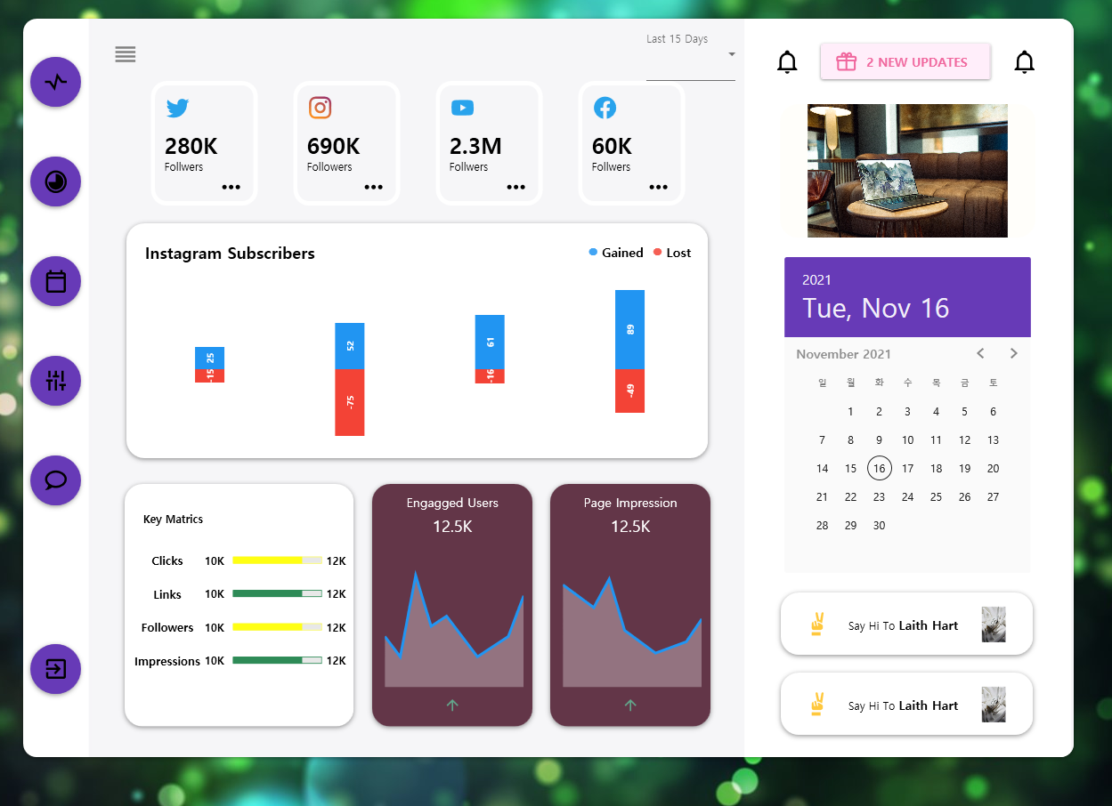
using LiveCharts;
using LiveCharts.Wpf;
using System;
using System.IO;
using LiveCharts.Defaults;
using System.Windows.Controls;
using System.Windows.Media.Imaging;

namespace wpf_test04UT2
{

  public partial class Dashboard : UserControl
  {
    public SeriesCollection SeriesCollection { get; set; }
    public SeriesCollection LastHourSeries { get; set;  }
    public SeriesCollection LastHourSeries1 { get; set;  }
    public string[] Labels { get; set; }
    public Func<double,string> Formatter { get; set; }
    public Dashboard()
    {
      InitializeComponent();
      SeriesCollection = new SeriesCollection{
        new StackedColumnSeries
        {
          Values = new ChartValues<double> {25, 52, 61, 89},
          StackMode = StackMode.Values,
          DataLabels = true
        },
        new StackedColumnSeries
        {
          Values = new ChartValues<double> {-15, -75, -16, -49},
          StackMode = StackMode.Values,
          DataLabels = true
        }
      };
      LastHourSeries = new SeriesCollection
      {
        new LineSeries
        {
          AreaLimit = -10,
          Values = new ChartValues<ObservableValue>
          {
            new ObservableValue(3),
            new ObservableValue(1),
            new ObservableValue(9),
            new ObservableValue(4),
            new ObservableValue(5),
            new ObservableValue(3),
            new ObservableValue(1),
            new ObservableValue(2),
            new ObservableValue(3),
            new ObservableValue(7),
          }
        }
      };
      LastHourSeries1 = new SeriesCollection
      {
        new LineSeries
        {
          AreaLimit = -10,
          Values = new ChartValues<ObservableValue>
          {
            new ObservableValue(13),
            new ObservableValue(11),
            new ObservableValue(9),
            new ObservableValue(14),
            new ObservableValue(5),
            new ObservableValue(3),
            new ObservableValue(1),
            new ObservableValue(2),
            new ObservableValue(3),
            new ObservableValue(7),
          }
        }
      };
      Labels = new[] { "Feb 7", "Feb8", "Feb 9", "Feb 10" };
      Formatter = GetValue => GetValue.ToString();
      DataContext = this;
      string imgCartoon = Directory.GetCurrentDirectory().ToString()+"\\Images\\aaa.jpg";
      string imgavatar  = Directory.GetCurrentDirectory().ToString()+"\\Images\\bbb.jpg";
      ImgCartoon.Source = new BitmapImage(new Uri(imgCartoon));
      avatar1.Source = new BitmapImage(new Uri(imgavatar));
      avatar2.Source = new BitmapImage(new Uri(imgavatar));
    }
  }
}
5. 결과
좀 있어보이나요? 좌측 메뉴가 동영상 강좌랑 달리 스타일이 안들어간 것 같습니다만, 수정하기 귀찮네요..필요할 때 하다보면 되겠죠..??ㅠㅠ